How to Build an Expense Reimbursement Form
Handling employees’ expenses can be a huge headache. This doesn’t just create paperwork for colleagues on the ground. It also burdens finance teams with assessing submissions and processing payments.
Today, we’re checking out how expense reimbursement forms can transform this experience.
Specifically, we’ll see how Budibase empowers teams to create advanced forms in a fraction of the time.
By the end, we’ll have a fully functional, custom expenses form that works beautifully on all devices.
Let’s jump right in.
What is an expense reimbursement form?
An expense reimbursement form is a simple UI for colleagues to submit information about the costs they’ve incurred at work - and then claim these back from the company.
Creating this isn’t necessarily too challenging from a technical standpoint. Instead, the tricky thing is creating a sleek user experience that maps to existing business rules.
So, in the first instance, we want to give users an efficient way to submit the right information. On top of this, we’ll typically also want to give finance colleagues a way to review and approve our form submissions.
Therefore, when it comes to building an expense form, the priority is having the flexibility to accurately mimic internal processes and workflows.
With that in mind…
What are we building?
The core of our app will be an advanced form for users to submit expense claims. We’ll give them the flexibility to add just one submission - or complete our form multiple times in one session.
This will also feature auto-populating fields and file uploads for submitting receipts.
Then, we’ll add an admin screen, where finance colleagues can search, view, review, and approve submissions.
All of this will be built on top of our internal low-code database - but we could just as easily create it using a huge range of external data sources.
Even better, with Budibase’s autogenerated UIs, we’ll have a fully custom, professional form UI in a matter of minutes - without writing a single line of code.
How to build an expense reimbursement form in 5 steps
If you haven’t already, sign up for a free Budibase account to start building as many forms as you’d like.
1. Creating our data table
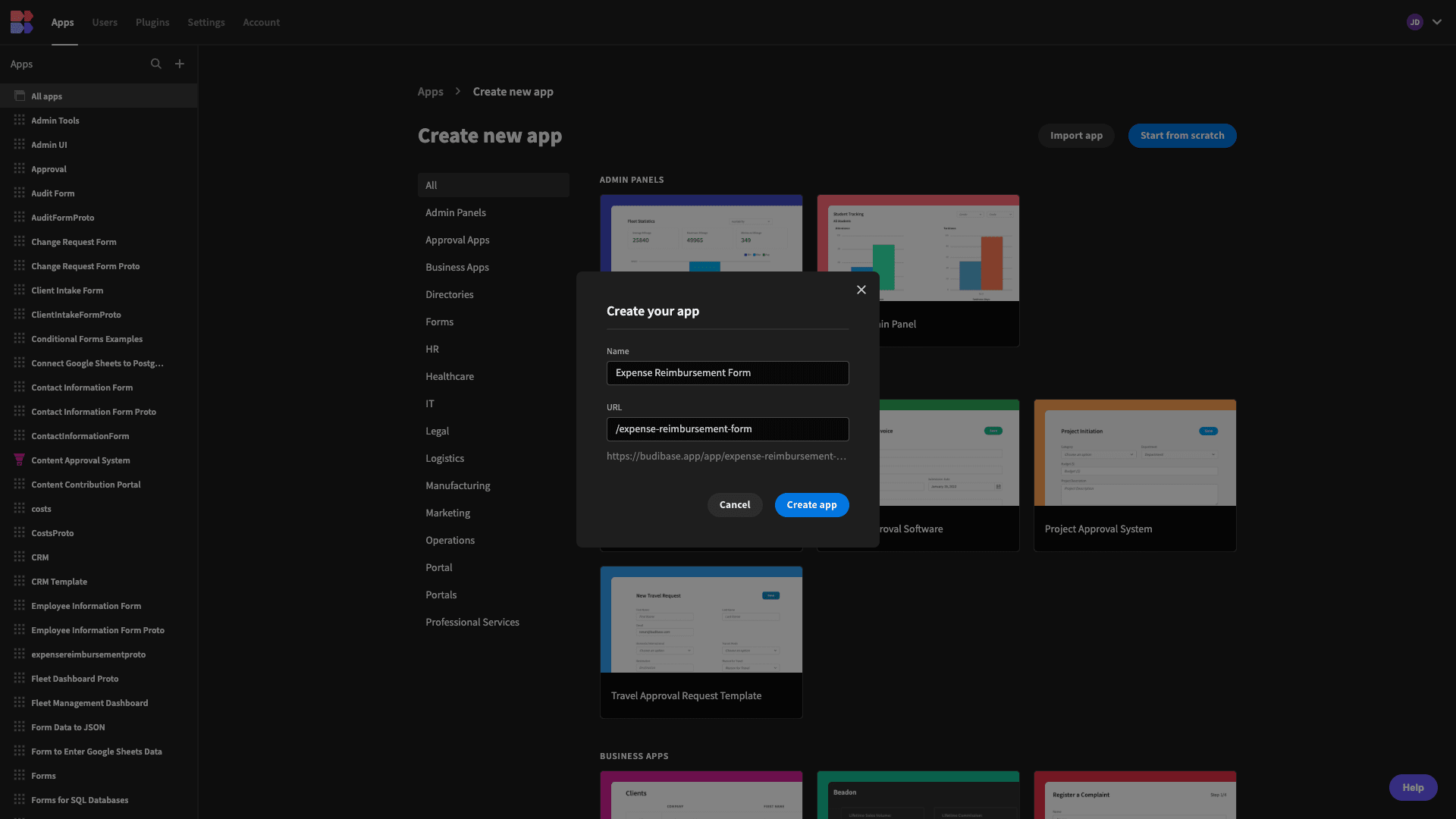
The first thing we need to do is create a new Budibase application. We can use a template or import an existing app, but today we’re starting from scratch. When we choose this option, we’re prompted to choose a name and URL extension for our app.
Then, we need to choose a data source. Budibase offers dedicated connectors for a range of RDBMSs, NoSQL tools, APIs, Google Sheets, Airtable, and more - giving us unrivaled power to query or manipulate existing data.
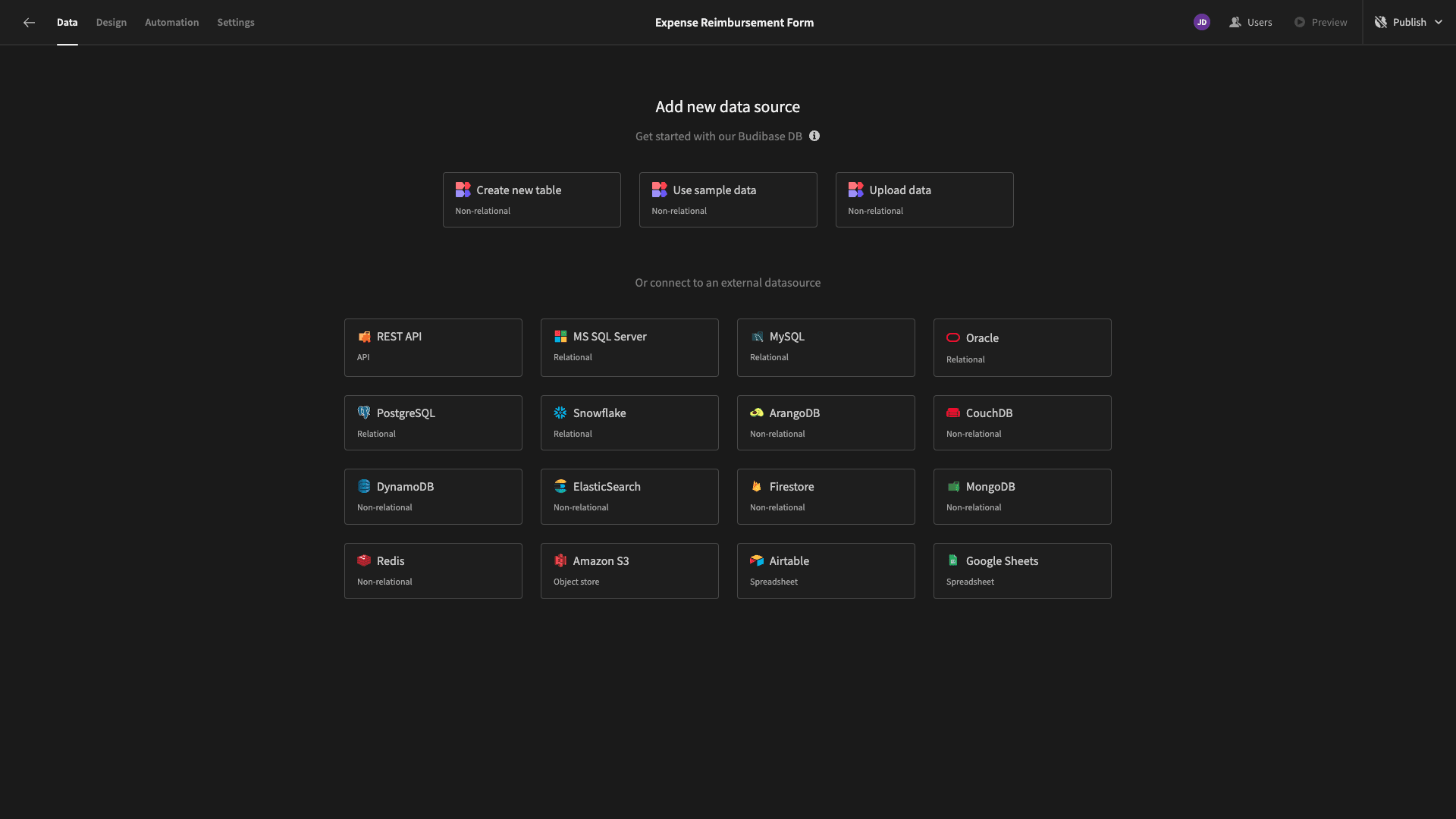
Today, though, we’re using our internal database to create our form schema from scratch.
When we choose this option, we’re asked to give our new table a name. We’ll call ours ‘expenses’.

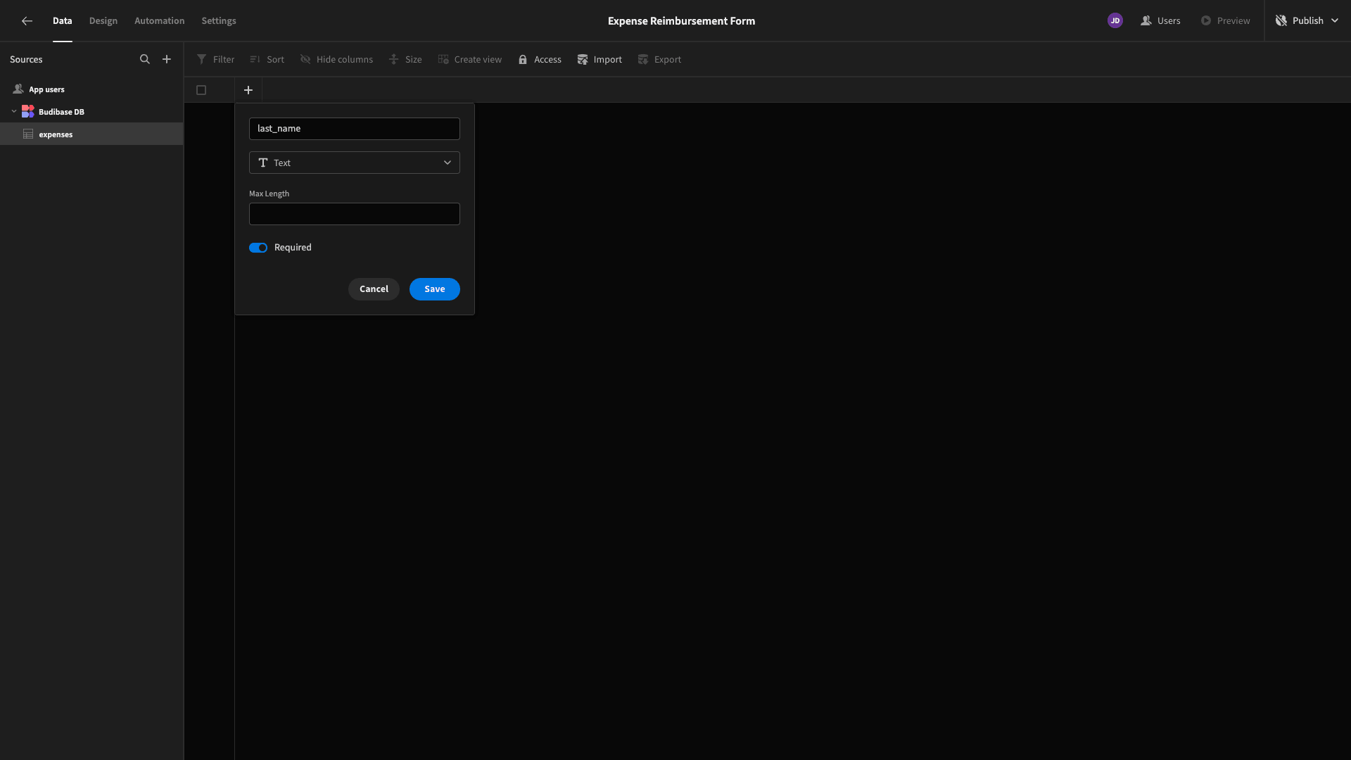
Here’s what our blank table looks like. We can use the plus icon to start adding columns - including giving them a name and data type.

We want to use our table to store the following attributes:
- last_name - Text,
- first_name - Text,
- date - Date,
- cost - Number,
- description - Long-Form Text,
- category - Options,
- method - Options,
- receipt - Attachment,
- status - Options.
We’ll also set all of these to Required.
Here’s what the table will look like once we’ve added all of our columns.

All of these will be included in our expense reimbursement form except for the status attribute. This will be automatically set to an initial value - which can then be updated later as part of the review and approval process.
The last thing we need to do to complete our data schema is define the available options for the category, method, and status fields.
We can do this using the Add Options button within each. For our Category field, the options are:
- Travel,
- Equipment,
- Client Management,
- Petty,
- Other.

For our method attribute, we’ll use:
- Company Card,
- Personal Card,
- Cash,
- Cheque.
The options for our status attribute are:
- Submitted,
- Approved,
- Declined.
Once we’ve added these, our data model is complete.
2. Building our form UI
So, we can start building our expense reimbursement form. Start by heading over to the Design tab. Here we’ll be offered several options for creating our first UI.
We’re choosing Blank Screen.
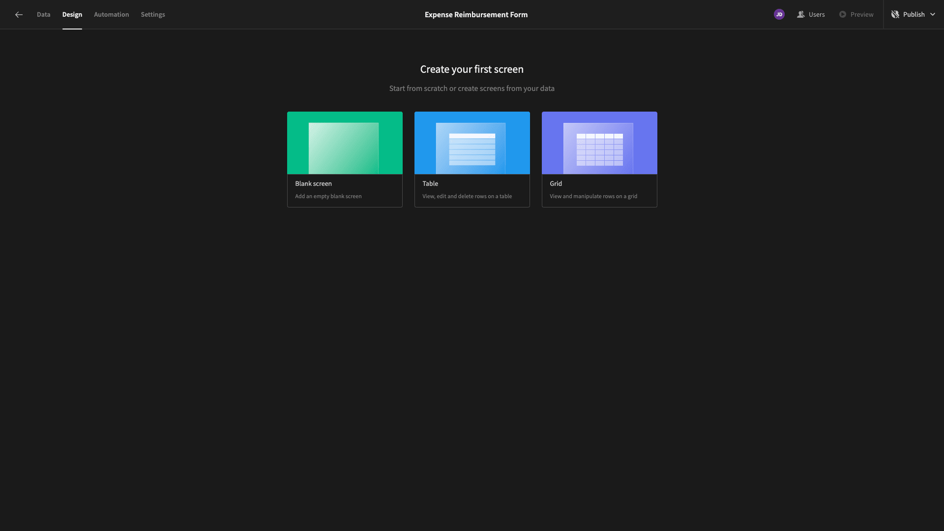
We’re then prompted to choose a URL path for our screen.
We’re choosing /new-expense.
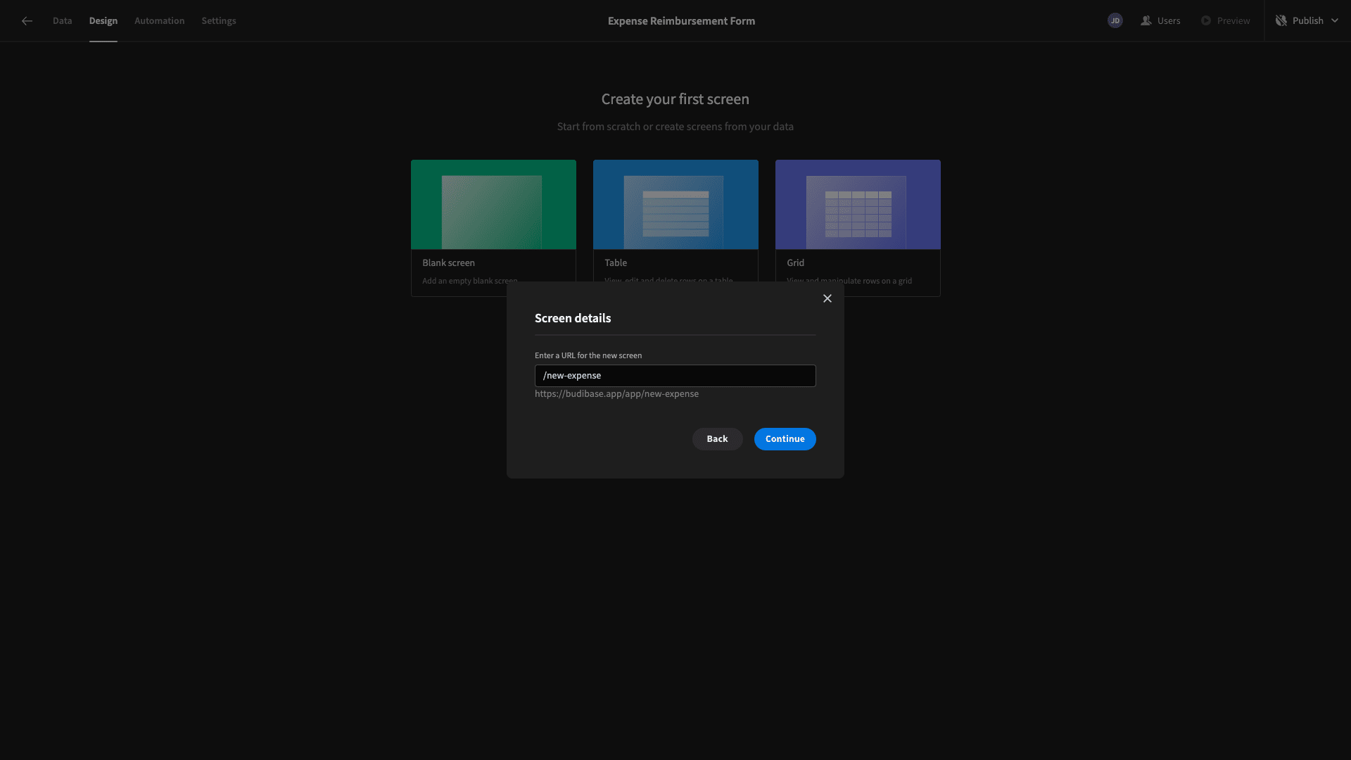
Then, we’re asked which access role users will need to view this screen with Budibase’s built-in RBAC system.
We’ll leave this set to the default option - Basic.
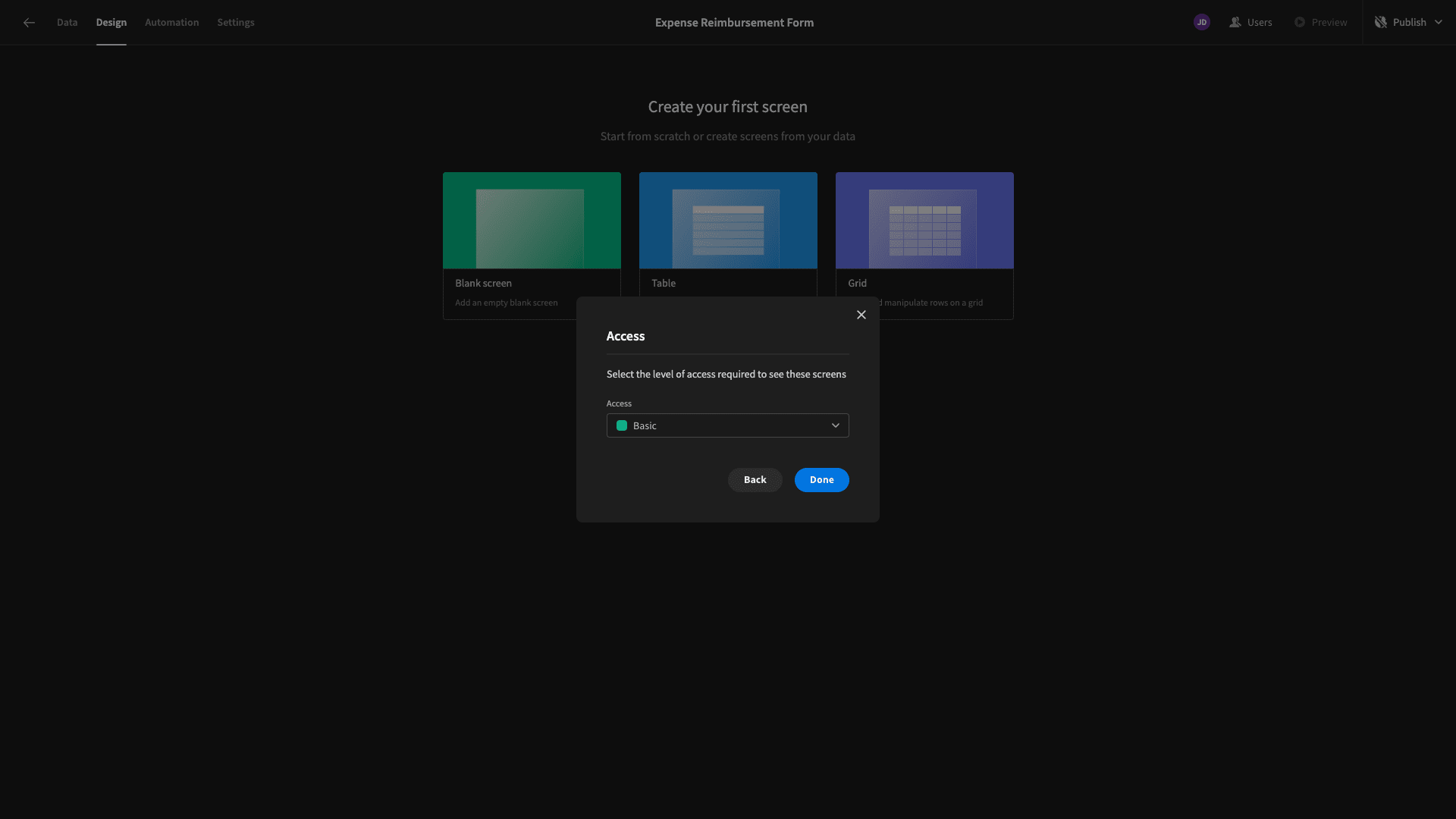
Now, we have a blank screen.
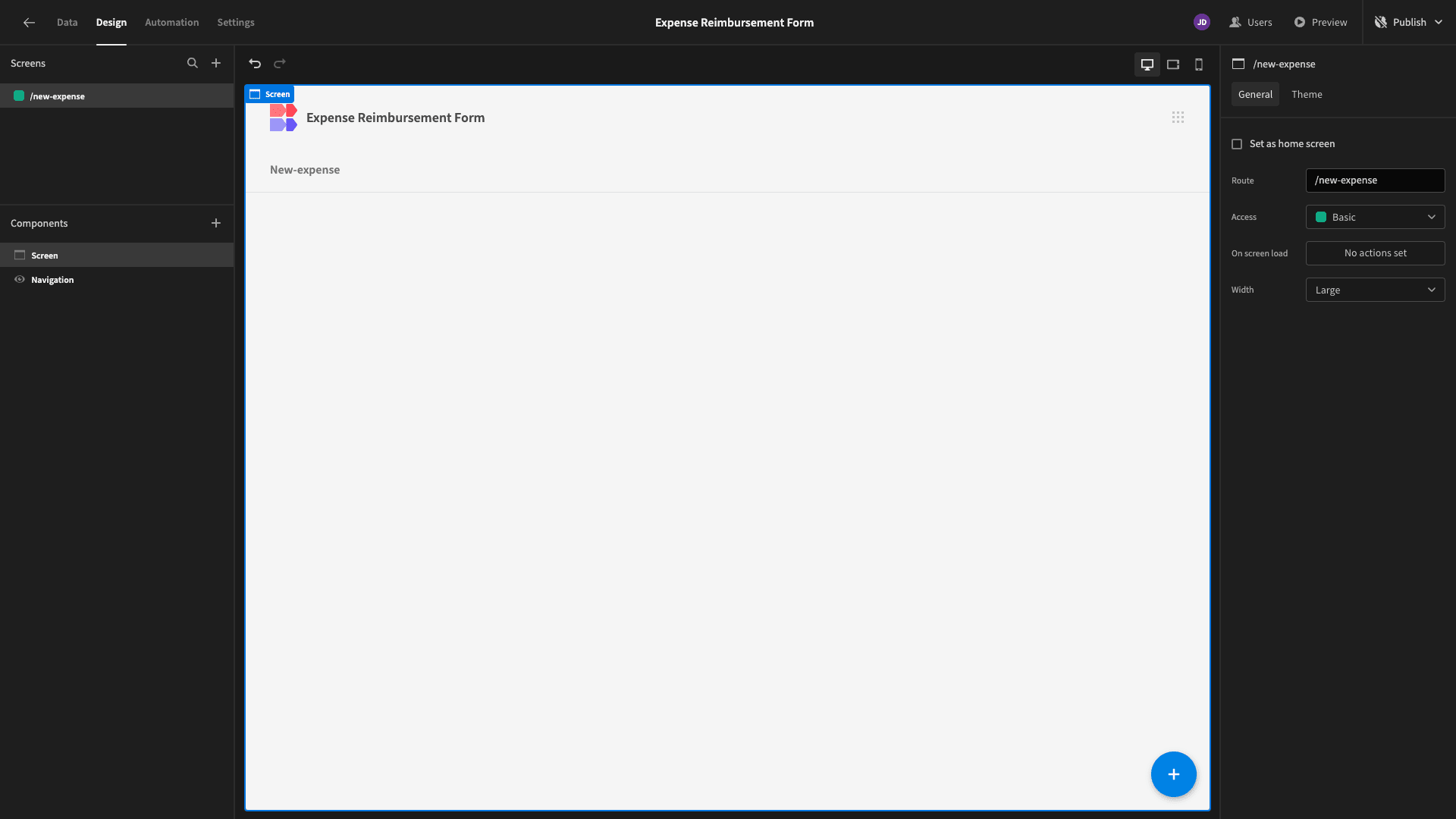
We’re going to add a Form Block. This is a pre-configured set of components that outputs a working form based on whichever data table we point it at.
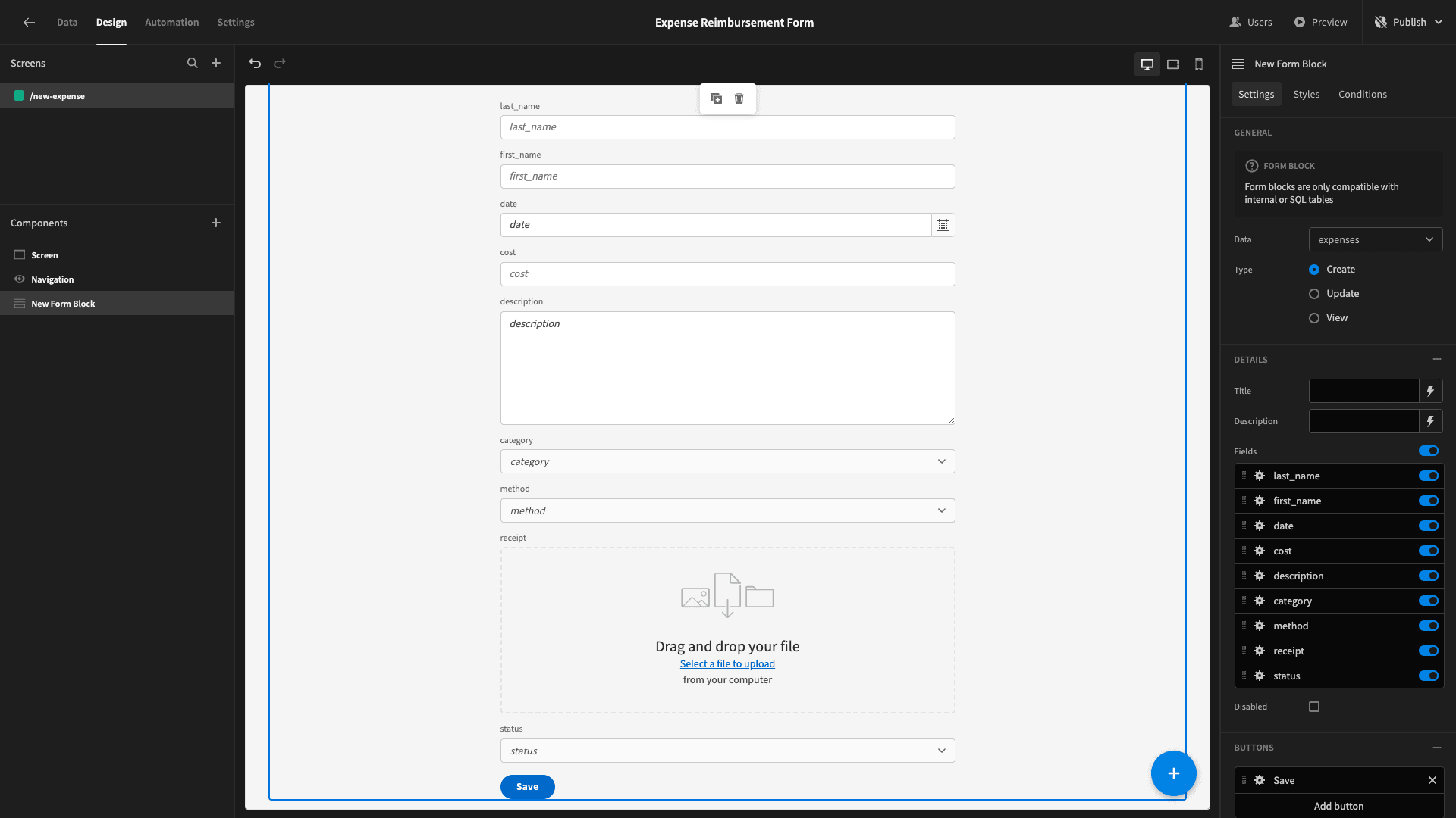
Since our form is comparatively long, we want to make a few layout tweaks - so we’re making better use of the space.
We’ll start by disabling the status attribute as we want to apply a value to this systematically.

Next, we can use the Layout setting with each attribute’s options to arrange some of our form fields into columns.

We’ll do this with first_name, last_name, date, cost, category, and method.

Then, we’ll set our Button Position to Top and our Size to Large.

We’ll also add a title.

This is a much better layout, but we can make one more UX enhancement. Currently, the display text for each form field is simply the name of the attribute as it’s stored in our database.
We can use the Label and Default text settings to update these to more human-readable copy.

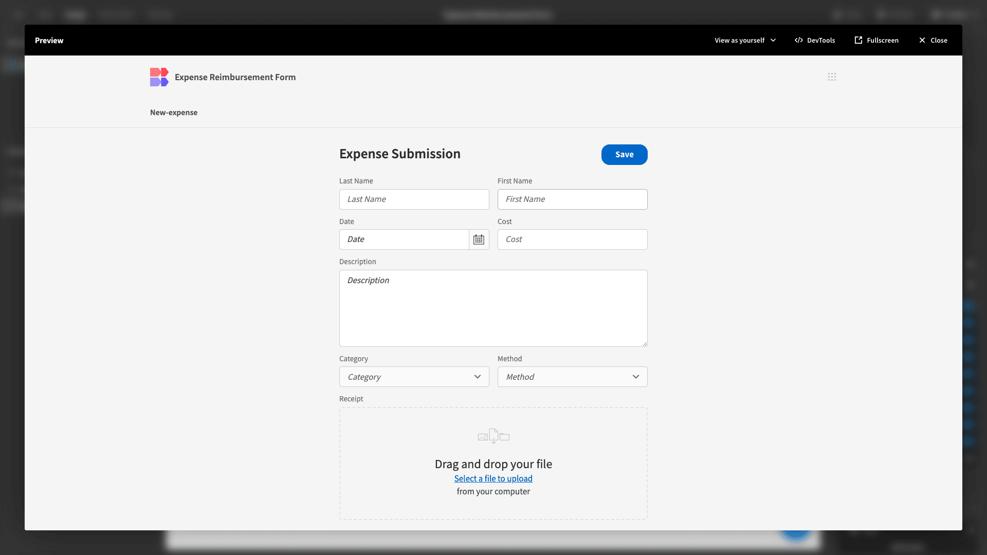
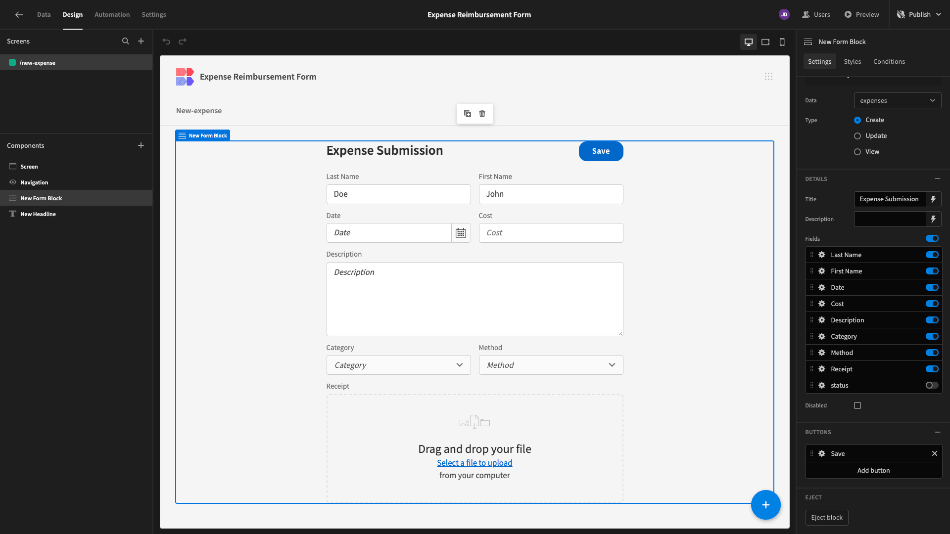
Here’s our form so far.
3. Auto-populating values and looping submissions
Budibase stands apart for empowering teams to build advanced forms with minimal custom code.
We want to make our users’ lives easier by automatically populating certain information that we already know about them. For example, we’ll typically know who the current user is, so we can autopopulate their name using contextual bindings.
So, within our Last Name field, we’ll use the lightning bolt icon to open up the bindings drawer for the Default Value setting.
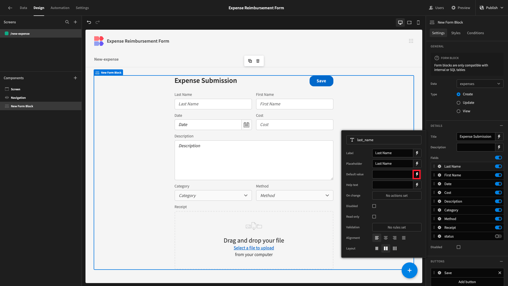
Here, we can see all of the categories of bindable values that this component is exposed to. We can use these as they are - or within more complex JavaScript and Handlebars expressions.
We’re choosing Current User.
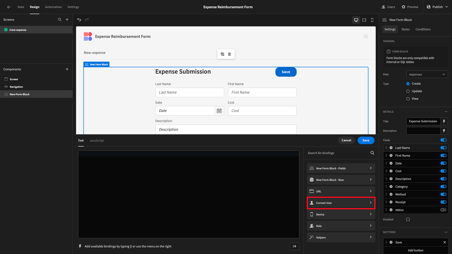
And here, we’ll find a value called LastName.

We’ll hit save and repeat the same process for the First Name field.
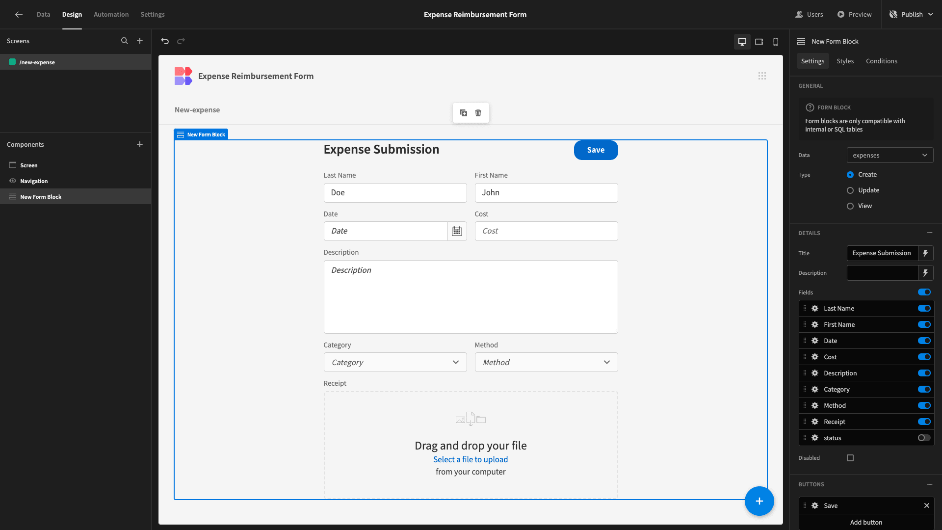
Now, our name fields are automatically populated with the current user’s name.
We also want to add looping submissions. This means we’ll allow users to hit the existing save button when they’re finished - or they can choose to save the current submission and then add another.
But, this is the only screen our Basic users will have access to. So, we need a way to give them feedback that their final submission has been saved successfully. To do this, we’ll use Budibase’s built-in conditionality rules.
First, we will open the Actions panel for our existing Save button.
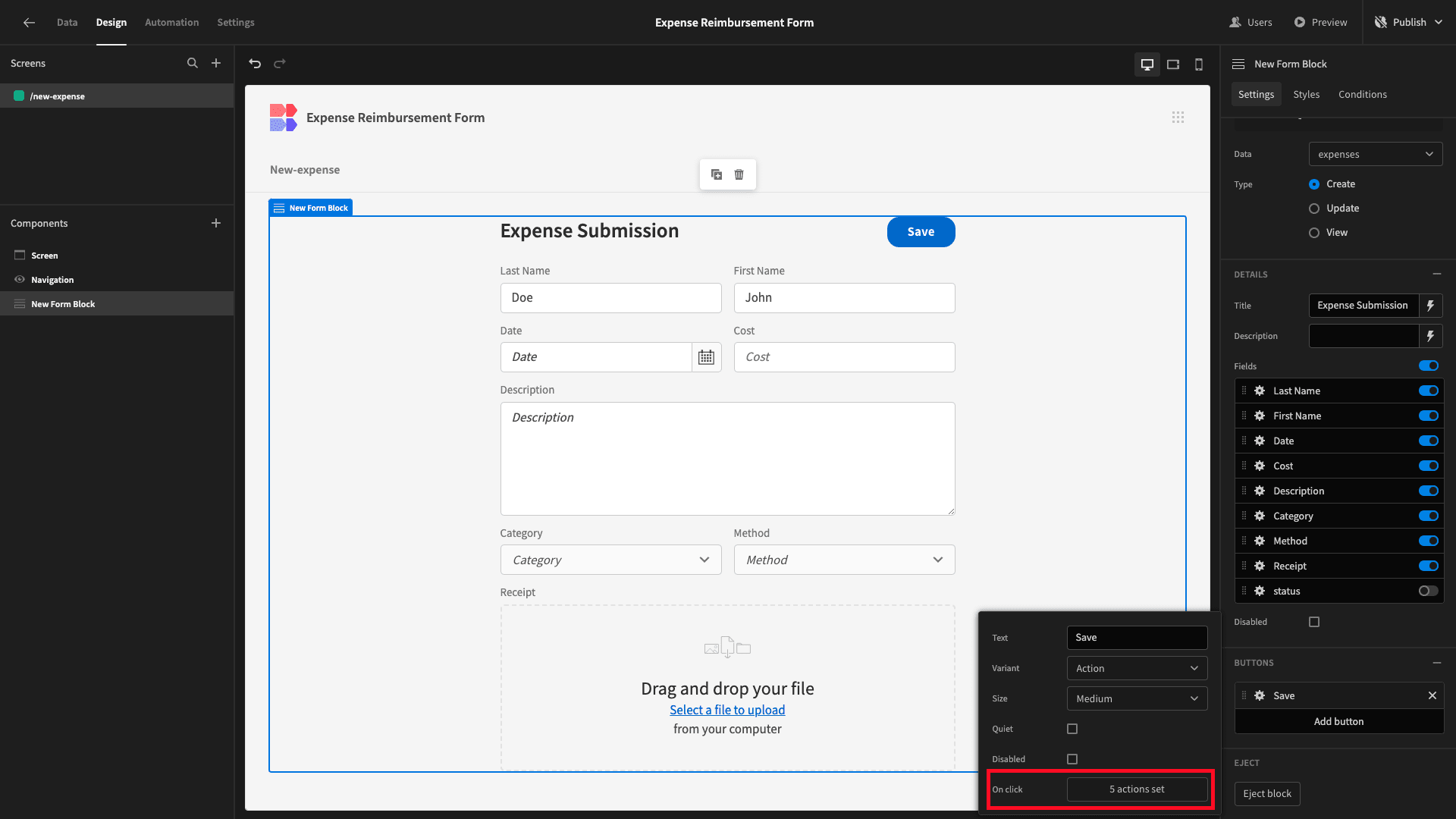
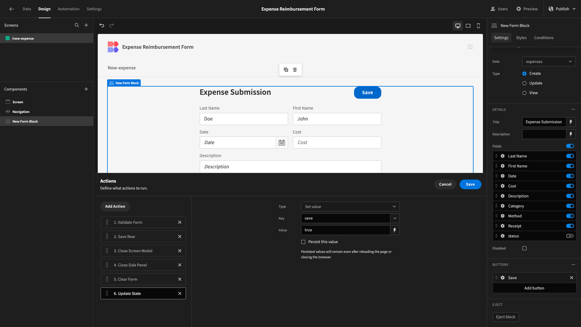
Here, we want to add a new action called Update State. This allows us to define a variable which we can add a value to any time a user hits our button.
We’ll set our Key to save and our Value to ‘true’.
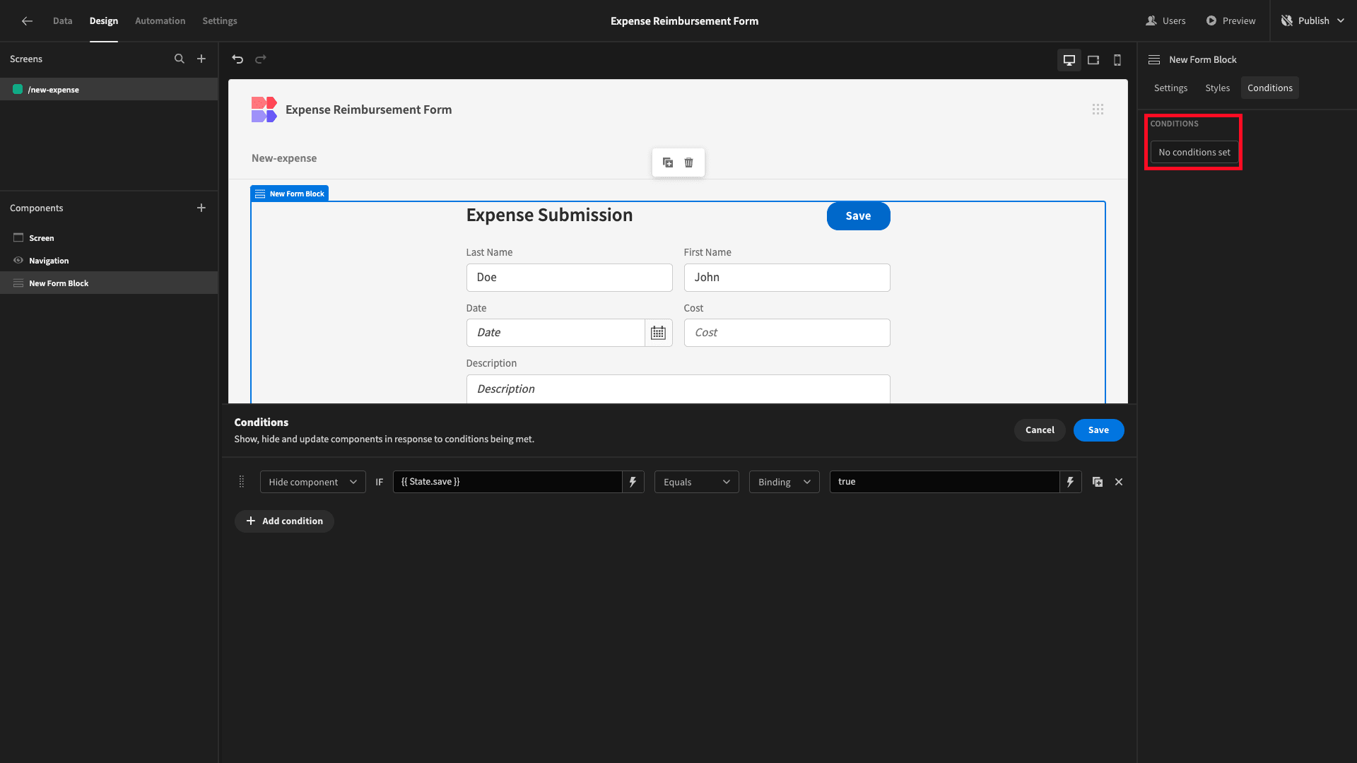
Then, we’ll open the conditionality editor for our Form Block, creating a new rule so that the component is hidden when {{ State.save }} equals true.
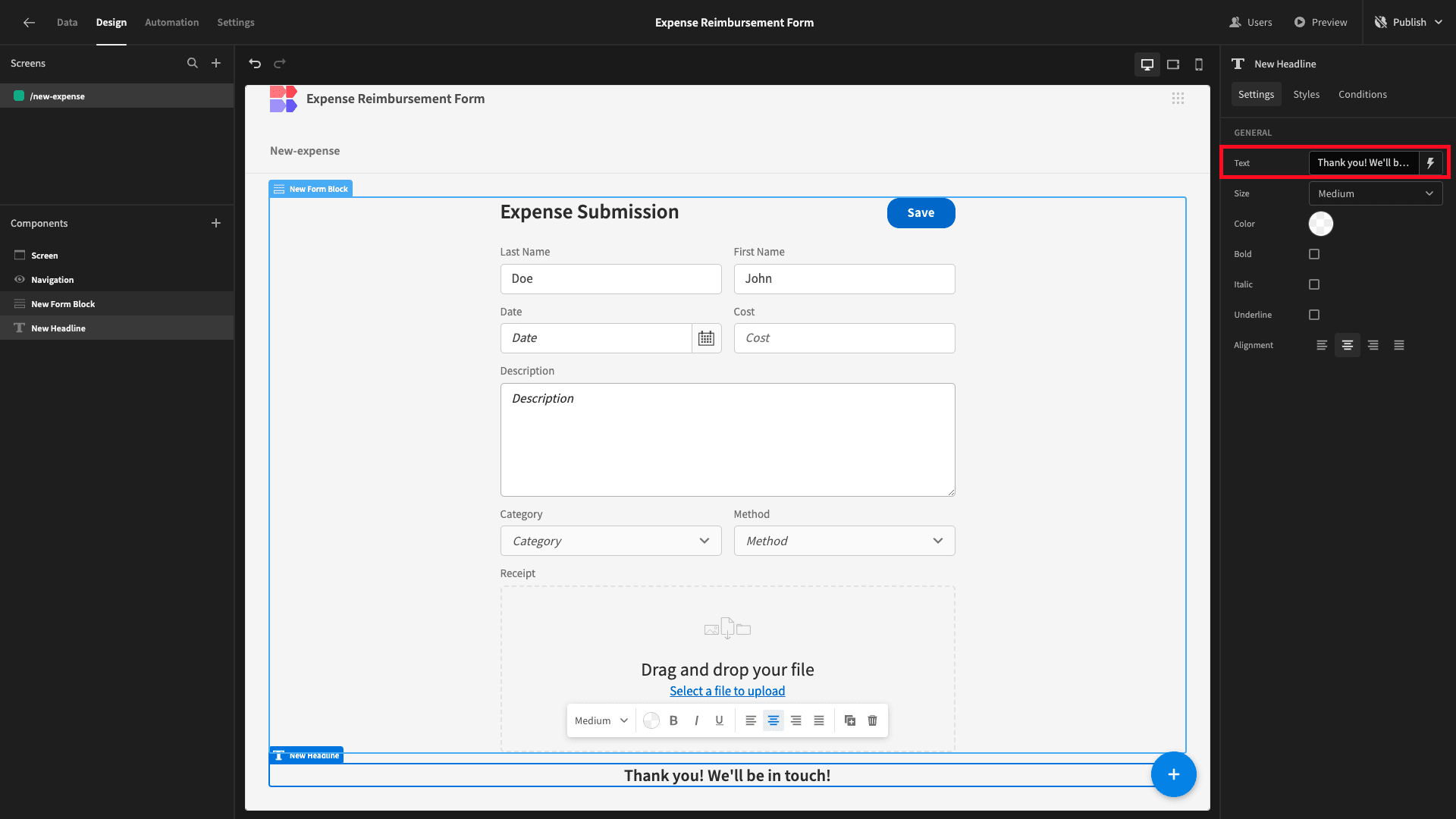
Below our Form Block, we’ll add a Headline component - setting its Text field to our thank you message.
And we’ll give this a corresponding conditionality rule so that it’s only displayed when our state is true.

We can see that our headline no longer appears in our builder window.
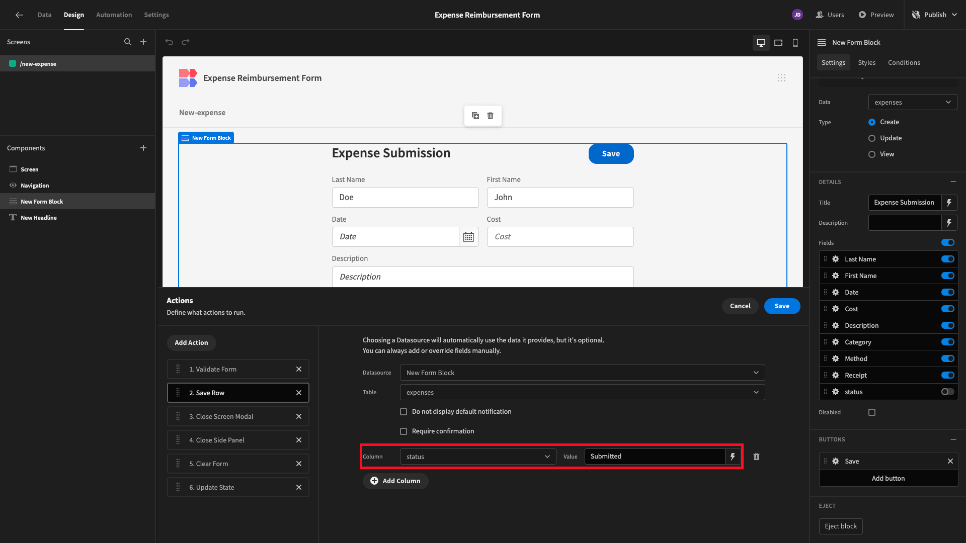
Before we can test this, we need to set our status attribute without a user submitting a value. So, open the Button Actions drawer again, this time selecting the existing Save Row action.
Here, we’ll hit the Add Column button.

We’ll set our status column to Submitted.
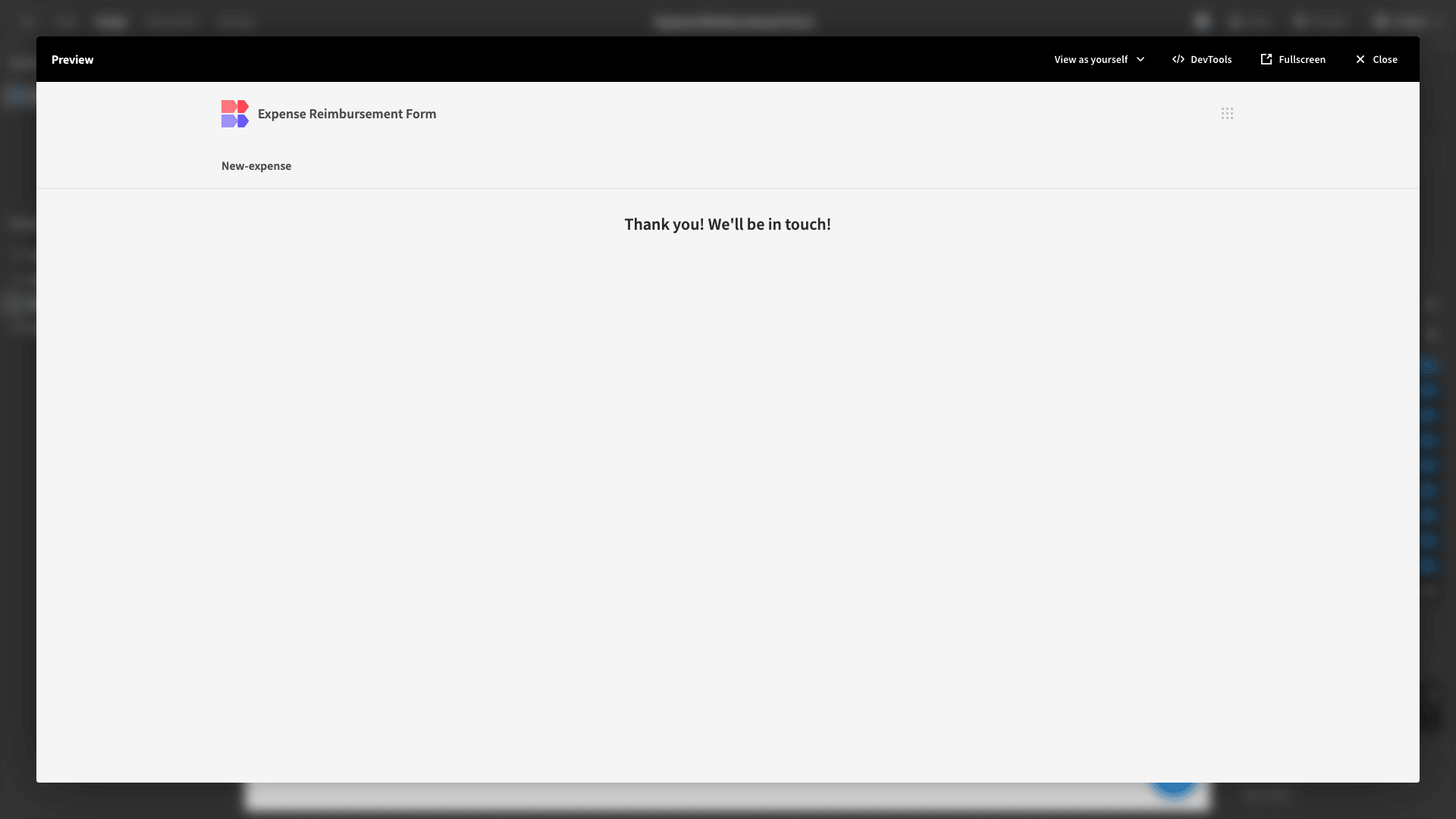
Now, we can open up our app preview and submit a new expense claim.

And when we hit save, we’ll see our thank you message.
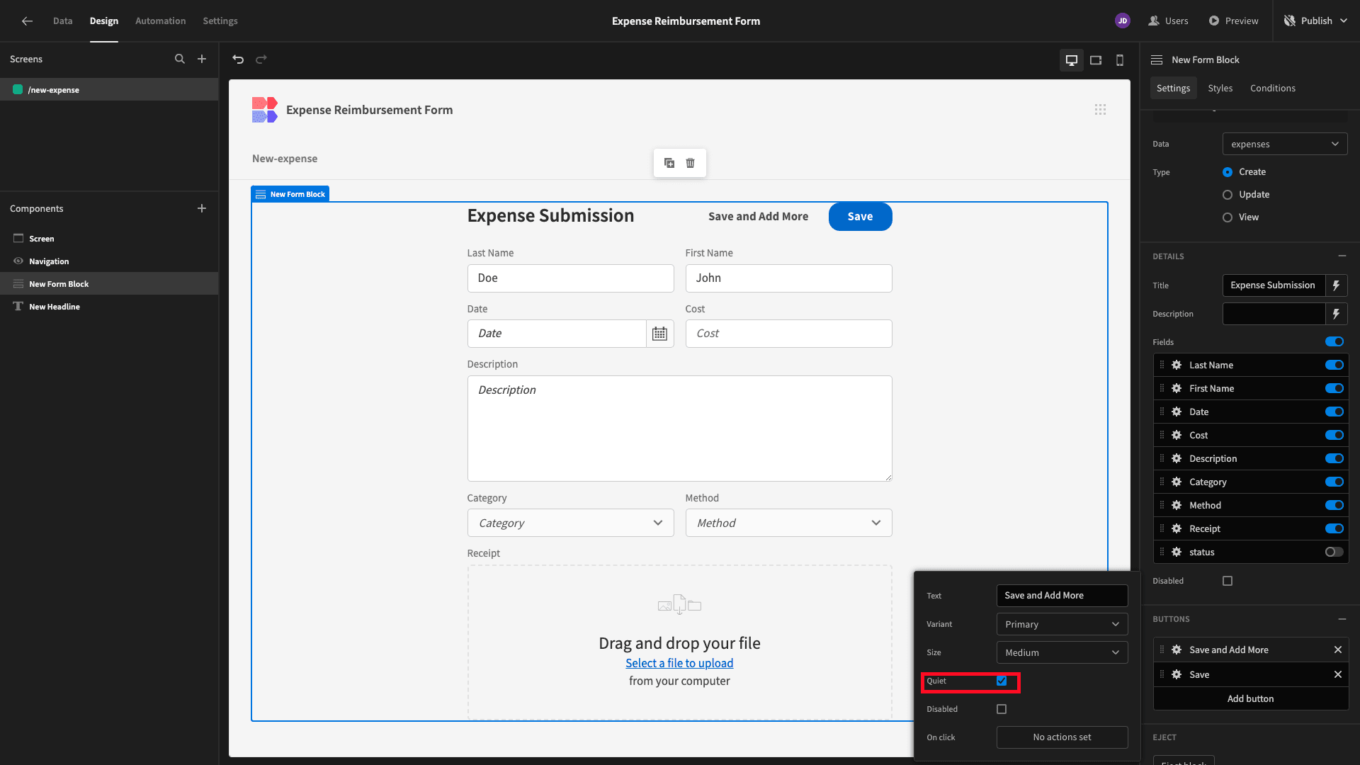
The last thing we need to do is add another button for users to save their submission and add another.
We’ll add a new button above our existing one.

Then we’ll give this a display text and select the Quiet option.
And lastly, we’ll add the following three actions:
- Validate Form,
- Save Row,
- Clear Form.
Remember to configure a value for the status attribute within this Save Row action too.
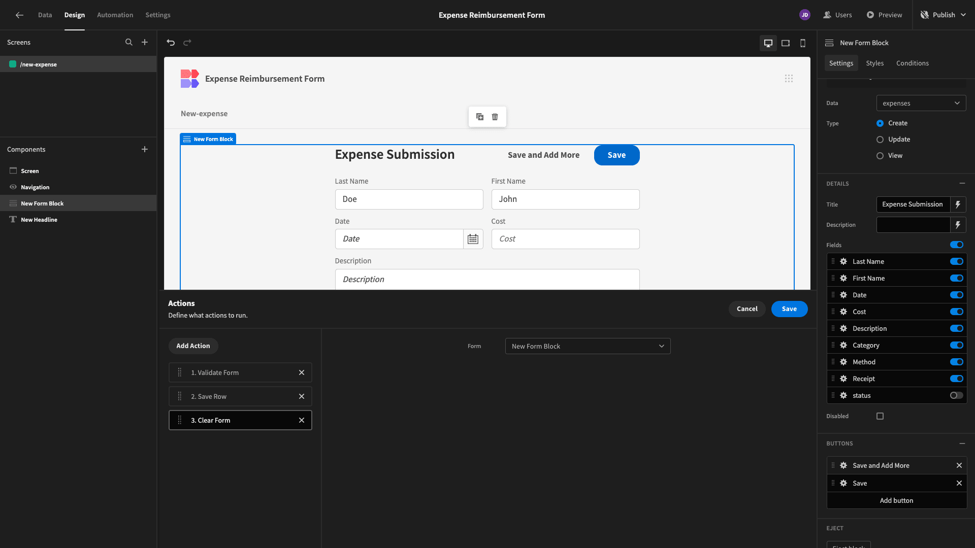
So, when a user hits our new button, the submission is saved, and the form fields are cleared so that they can add as many more expense claims as they’d like.
4. Adding an approval flow
Next, we’re going to add a UI where the finance team can search and view submissions - as well as use a second form to approve or reject expense reimbursement claims.
So, we’ll add a new screen. This time, we’re choosing the auto-generated Table layout.
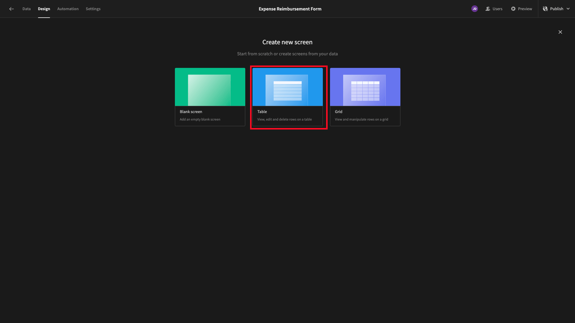
This generates a full CRUD UI based on the table we connect it to.

However, we’re going to configure this for our own purposes, rather than using it as a CRUD tool.
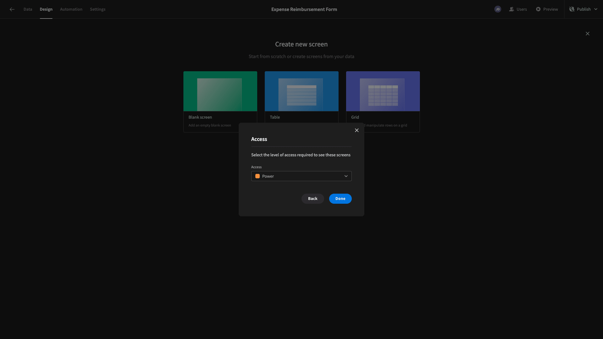
When prompted, we’ll set the minimum role required to access this screen to Power.
Here’s what our screen looks like.

Before we get to set up our approvals flow, we’ll start by making some design tweaks to make this table more attractive.
First off, we don’t need the Create Row button, as we’ve already created a dedicated screen for this - so we’ll disable the Show Button setting.
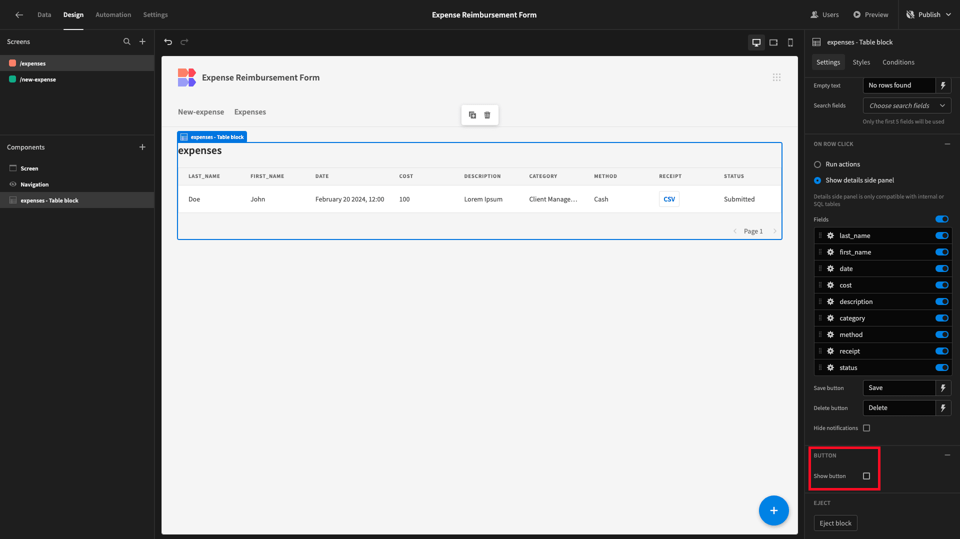
We’ll also capitalize our title.

We can also declutter our table by removing some of the less important columns. So, we’ll open the Columns drawer and start by hitting Add All Columns.
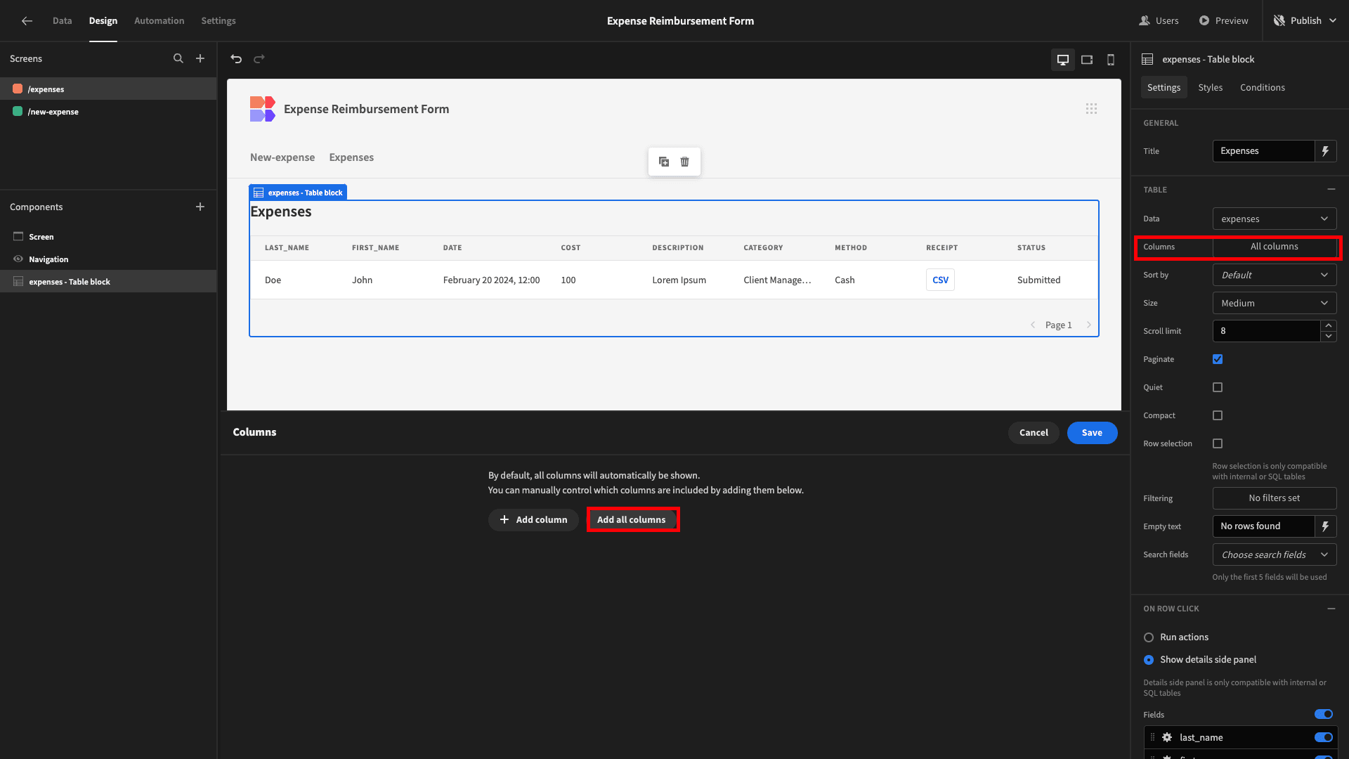
Then we’ll use the X icons to remove the description, method, and receipt attributes.

Now our table is a little tidier and easier to scan.

The last change we’ll make to our table is adding a few search fields. We’re choosing last_name, date, and category.

Next, we create our approval functionality.
Currently, when a user clicks on a row, they’ll see a side panel containing a form where they can edit the existing values.
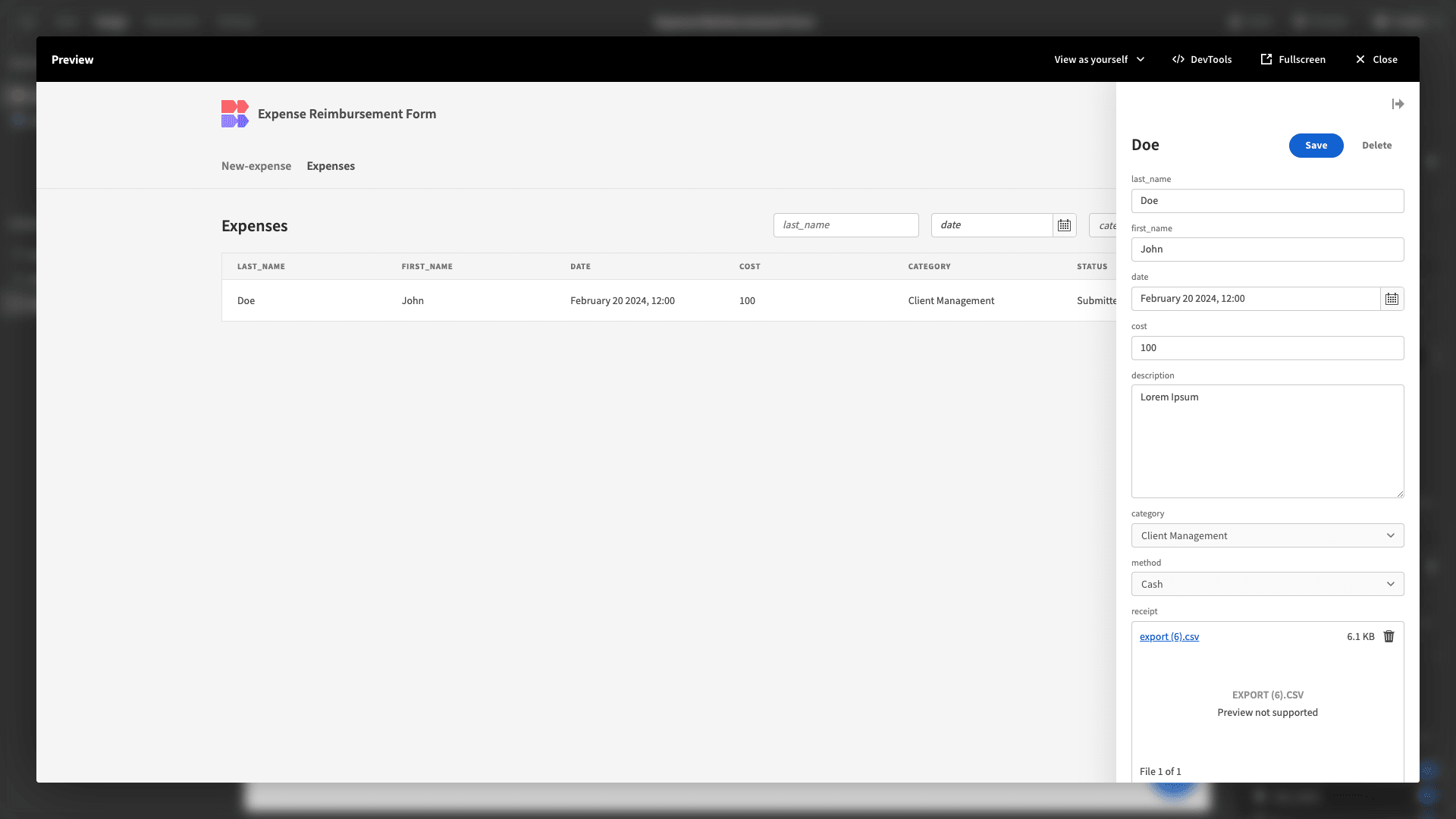
We want to make two changes to this, to provide a better UX:
- Users should only be able to update the status attribute.
- We want this form’s layout to match our form from earlier.
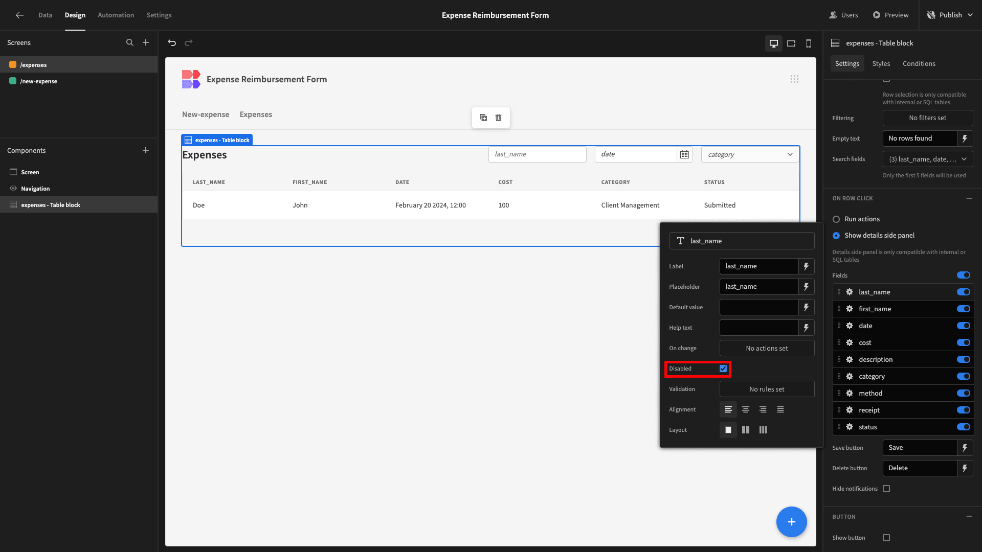
We’ll make all fields except for status read-on by ticking the box for Disabled.
Then, we’ll update the display texts and arrange our fields into columns, just like we did earlier.
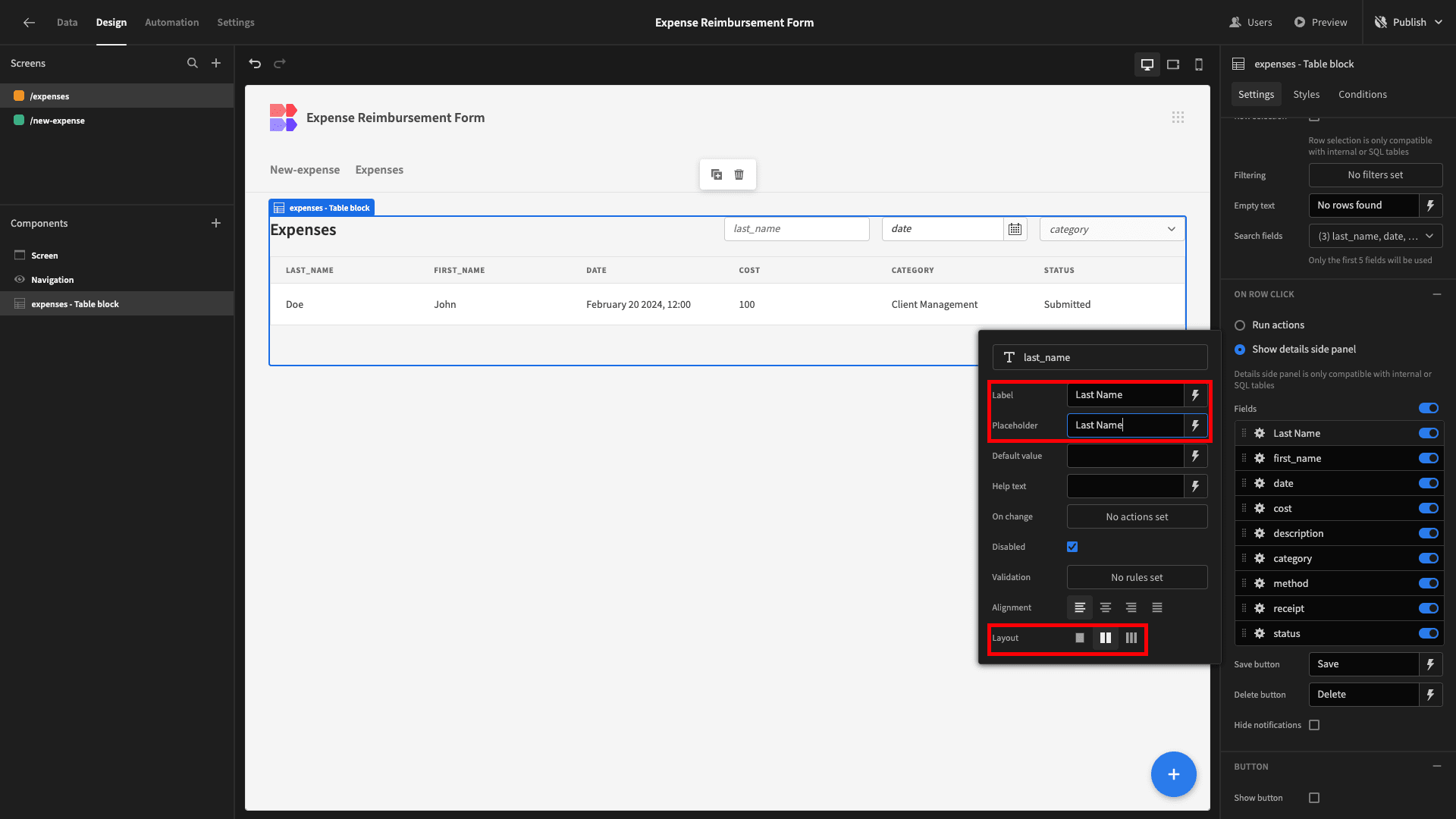
Here’s how this should look.
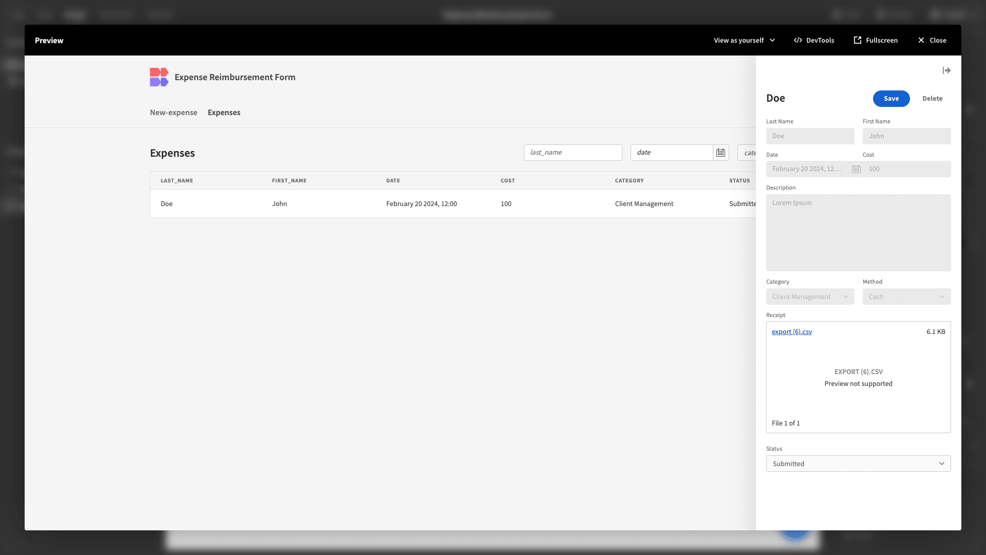
And that’s our second expense reimbursement form finished.
5. Design tweaks and publishing
We’re almost done. But, before we push our app live, there are a few final design and UX improvements we can make.
First, we can tidy up our navigation bar under Navigation and Configure Links. Specifically, we’ll update the display text and set the minimum role for both links to Power.
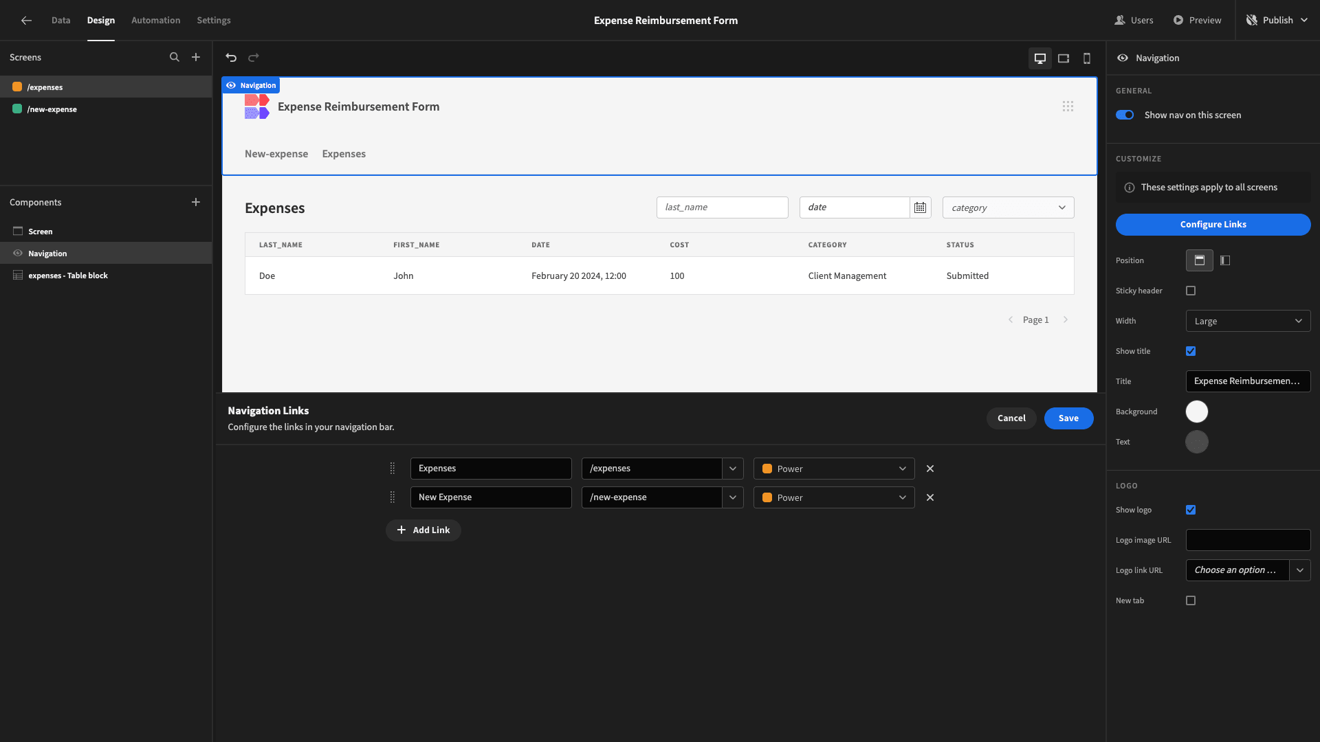
Now, Power users can navigate between screens using the menu.

However, this is not displayed to Basic users - as they can only access one screen anyway.

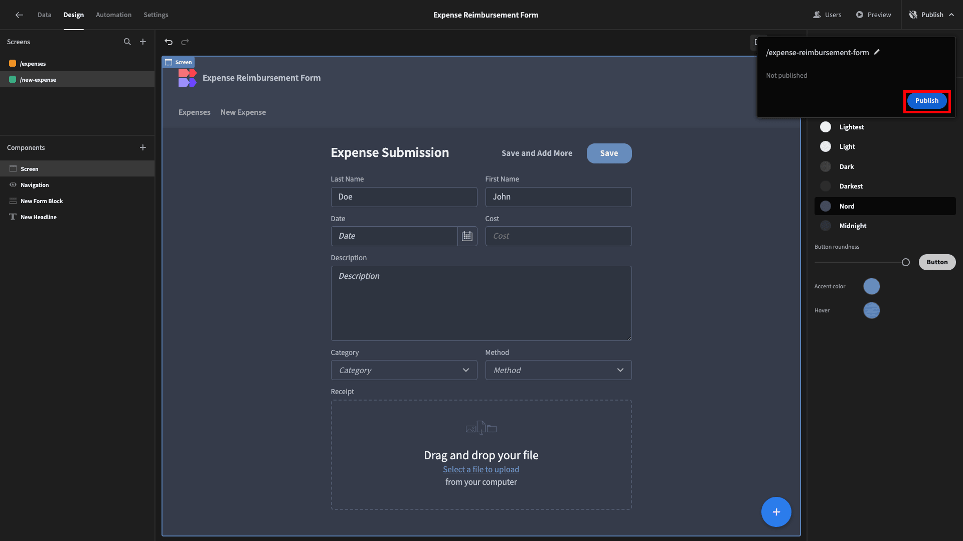
We’ll also set our app’s theme to Nord.

When we’re ready to push our expense reimbursement form live, we can do so by hitting Publish.
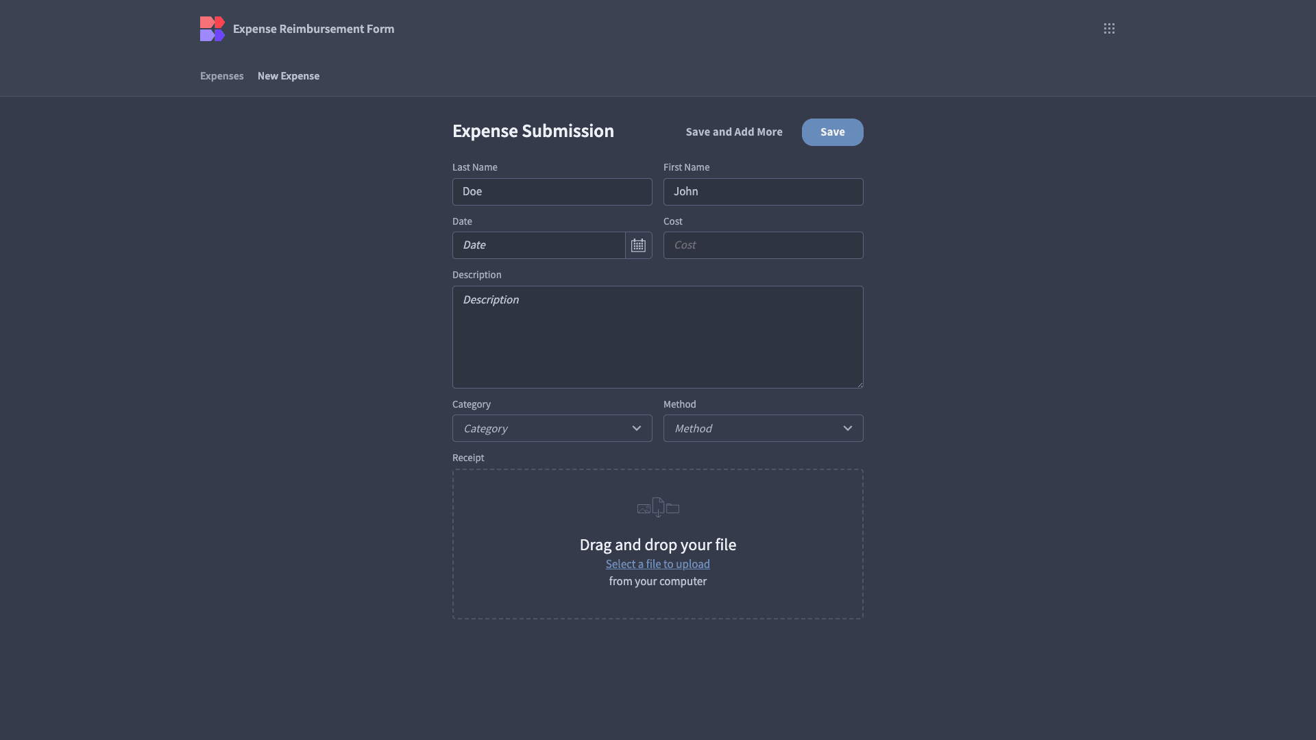
Here’s a reminder of what the finished product looks like.
Budibase is the fast, easy way to build advanced forms on top of just about any data source. To learn more, take a look at our forms page .